
Challenge
Shortly after I joined the Squawkin development team full time in the Fall of 2014, I was tasked with the challenge of documenting the entire UI for both the iOS and Android apps. While we all used the product daily, there was no definitive guide, digital or physical, that captured it as a whole. We needed an end-to-end reference to help designers, developers, and our product manager get—and stay—on the same page. I needed to create some sort of document, that could both hang on the wall and be accessed digitally, to show the organization and movement through the entire product.
Where to Begin?
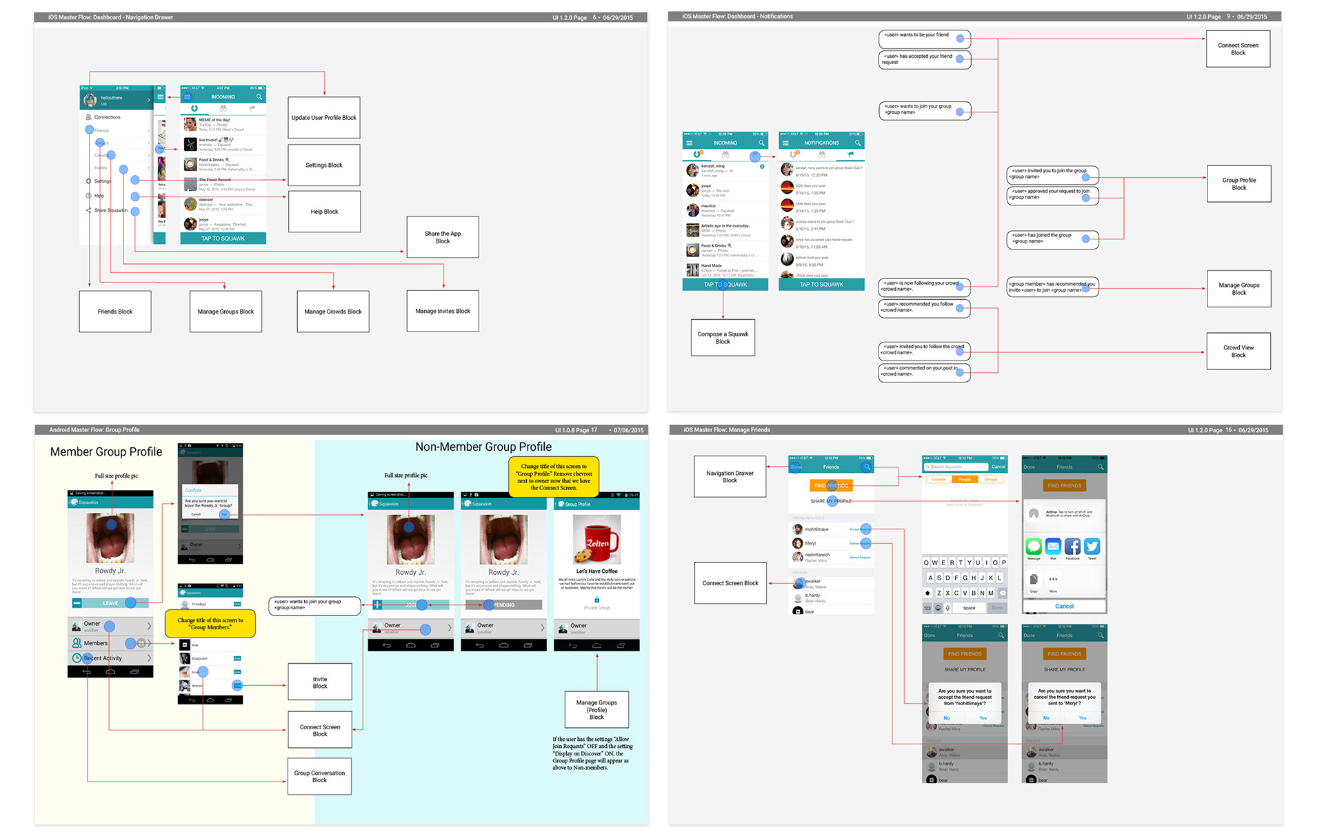
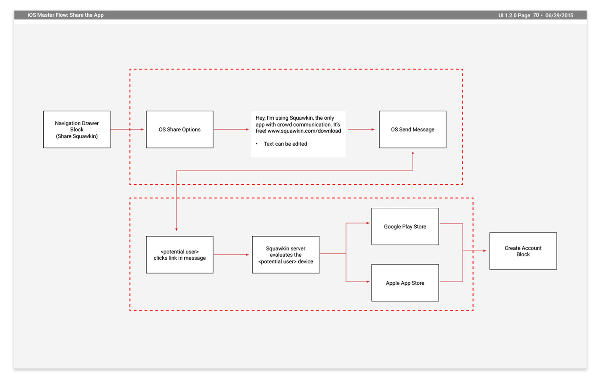
My first step was to step back. I needed a way to conceptualize the skeleton of the app, or see it from a bird's eye view. Secondly, I needed a way to identify the specific ways a person could move through the app to complete a task. My solution was to identify the static, primary elements as part of the app structure and the various paths through the app would be named and captured as flows. I began with the dashboard and worked outward. The map below became a living document that expanded as I articulated and identified discreet aspects of the product, which I called blocks, as either part of the flow or the structure.

Function over form
The urgency to realize this reference document meant a very short time frame for completion. Beginning with screenshots of the current production build of the app, I mapped each click and its destination. The emphasis of the design of the document was to communicate interactions; I let the layout of each page follow this emphasis.
Takeaways
Thinking of the product as a whole. The process of exploring every nook and cranny of our application allowed me to see more fully how all aspects of the app relate to one another. I began to think of the app more in terms of a collection of modules and less in terms of a sequence of screens. I could begin to see how, for example, functionality like search or camera could be written once and used repeatedly in all aspects of the app that required that functionality. I also began to see how the overall architecture of the app could be organized to make the navigation more efficient. For example, all administrator functionality for groups is located in a view accessed from the Navigation drawer. Why not make all group settings, for both the member and administrator, available inside the group conversation or group profile view?
In the spring of 2015, I read Paul Adams' remarkable post on Intercom's blog, which he republished on Medium, called The Dribbblisation of Design. It was a watershed moment, akin to first discovering Sketch, in the process of learning about UI design and digital products. Having worked on all aspects of our app, his thinking neatly and succinctly presented for me what constitutes a digital product and how to approach its development. My intuitive representation of the app into blocks and flows resonated with Adams' Structure and Interaction elements. I began to think about my feature to-do list in terms of Outcomes and the my effort to improve the visual consistency in the app in the realm of Visual Design. Perhaps most significantly, I saw how outcomes, structures, and interactions come first and follow that sequence of development. The 'fit and finish' of visual design comes later.
Interactive prototypes are essential. When the entire product was captured, the document devoted to the Android app was a whopping 61 pages. The one devoted to iOS was 57 pages. Completing the Master Flow opened my eyes to the limitations of static pages in a lengthy project to capture the relationship of the parts that make up a digital project. I immediately saw the value and importance of clickable prototypes. Afterword, I began researching and using tools such as Framer.js and Flinto to incorporate interactive mock-ups into my development process.
Choose your tools wisely. While this document was a first step in the process of fostering collaboration among our team, there were challenges maintaining the document and easily navigating its parts. While designers were comfortable editing the document in InDesign, our developers and project manager could only annotate the PDF. When I discovered InVision, I immediately recognized it's relevance not only as a way to show the flow through the app, but also as a way to centralize the discussion in one place using a tool all members of the team could master.