
Challenge
Squawkin Crowd Messenger began as a developer-driven software project. The alpha version was developed very rapidly with an emphasis on functionality and technology over the design of the interface and experience. While there is nothing inherently wrong with this approach, it put our developers in the position of having to make numerous design decisions as they encountered questions in the process of coding. Most often the agenda driving these decisions was expediency rather than a larger context of The Product. This ethos carried over into the beta phase of development. When I joined the development team, I made it one of my primary goals to reduce the design debt that had accumulated in the product. One area that needed attention was the lack of consistency in the visual design of the interface.
Process
Beginning with iOS, I worked closely with our developers to refine the product element-by-element, list-by-list, icon-by-icon. Wherever I could I used Apple's iOS Human Interface Guidelines as the standard. I defined consistent styles not covered by Apple and began to capture them in a dedicated page in my Sketch document. This page coalesced into the beginning of the style guide.
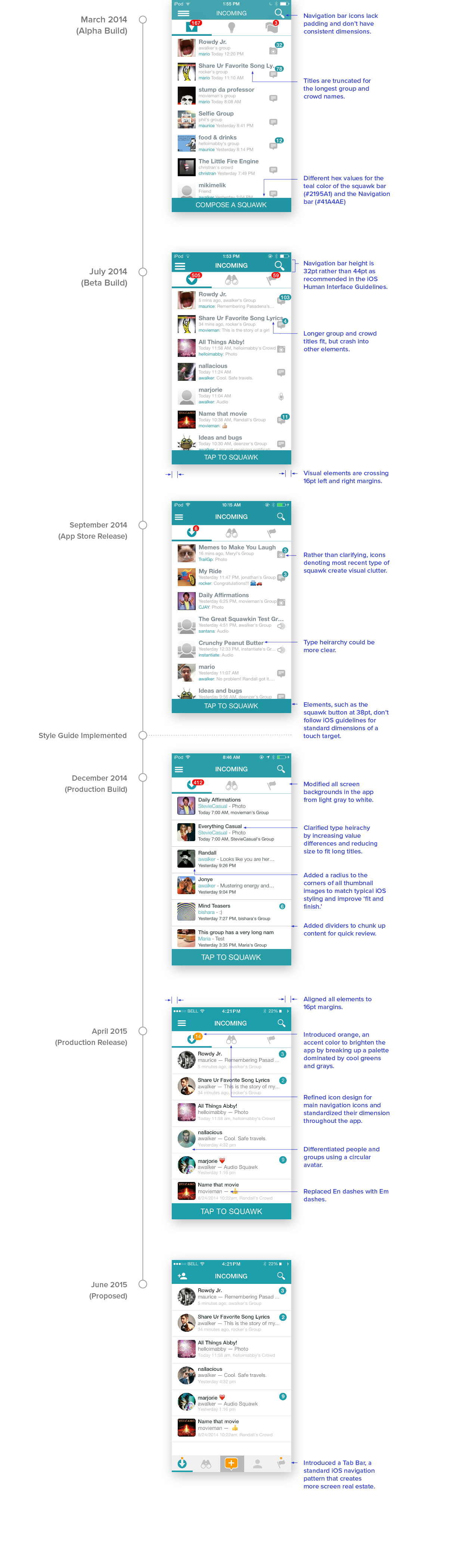
The Incoming view featured below is equivalent to an inbox and is the most viewed screen in the app. I'll walk you through refinements we made to the UI in this view over time. Once we had a style guide in place, the same changes were reflected throughout the app. I've also included revisions to the group profile view as an example.
The Incoming view featured below is equivalent to an inbox and is the most viewed screen in the app. I'll walk you through refinements we made to the UI in this view over time. Once we had a style guide in place, the same changes were reflected throughout the app. I've also included revisions to the group profile view as an example.
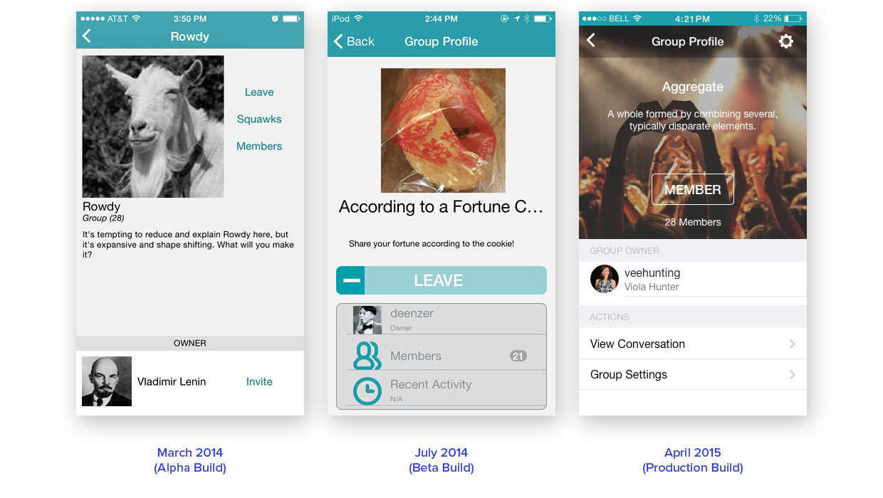
Screenshots of the Group Profile in alpha, beta, and the production build after creating the style guide.
Styling and Interaction
While we were making refinements to the layout and styling of the app, we were also refining flows and crafting better interactions. Below I've included an animation of a clickable prototype I created using Sketch and Flinto in February 2015. It demonstrates revamped search using standard elements, such as the segmented control, as well as style changes including consistent typography in our lists and use of orange as an accent color. In addition to standardizing the visual design, we also made search dynamic and allowed people to access any of their connections, or find new friends, without having to click through the Navigation Drawer.
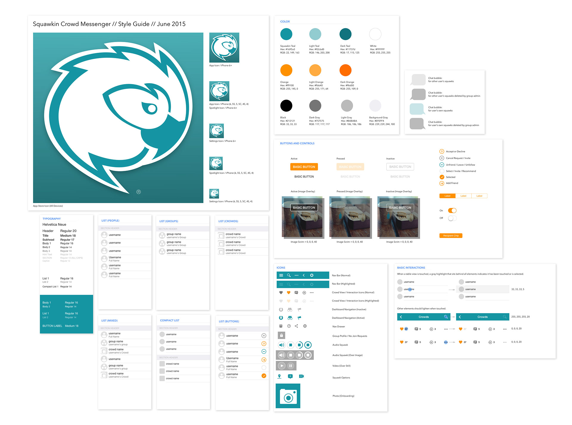
The Complete Style Guide
Once I defined all graphics in the style guide, I generated assets at 1x, 2x, and 3x to ensure a high quality appearance on all Apple devices. The developer and I created a Git repository to maintain image assets going forward. Rather than sending updated files via email or sharing on disk, I simply updated source and any updates to assets were included in the next build.
While the Android product had different issues, I advocated we use Google's Material Design framework to achieve visual consistency on this platform. Combined with the updated styling on iOS, we would achieve greater uniformity and stronger branding in the product as a whole by achieving consistency across both platforms. See the proposed UI updates for Squawkin on Android in this project: Android Material Design UI.
While the Android product had different issues, I advocated we use Google's Material Design framework to achieve visual consistency on this platform. Combined with the updated styling on iOS, we would achieve greater uniformity and stronger branding in the product as a whole by achieving consistency across both platforms. See the proposed UI updates for Squawkin on Android in this project: Android Material Design UI.
Takeaways
Improved development speed and efficiency. Creating a style guide allowed the developers and I to integrate new features much more rapidly and efficiently. Not only did we improved visual consistency in the app, we began using a consistent approach to developing it. This meant fewer questions from developers in the process of coding new features, eliminated the need for me to generate elaborate spec documents, improved accuracy of new UI elements, and reduced the QA we had to do before releasing a build.
Improved customer trust. When Squawkin launched, the visual design issues were significant enough to get in the way of enjoying the product. In many ways, design communicates a tone for the app. Ideally, the design fosters trust, viability, and credibility of the product. The design of the app became a non-factor, meaning the craftsmanship was at a level where it did not hinder the experience. Had we continued evolving the product, "delight" would have been the next goal. While improving the visual design of the app helped with some aspects of usability, it didn't, of course, improve the product's market fit or larger user experience issues.
When possible, begin early. Creating a style guide late in the product's life taught me that one should be started, even in a rudimentary form, early in the development process and it should be expanded and iterated upon alongside the evolution of the product. This point seems like a no-brainer, but experiencing it first hand crystallized the importance of introducing design early.