
Challenge
Once the product team decides to implement a new feature, how do I go about integrating it into the existing product?
Language
Rather than thinking about a series of screens with a layout of elements, I typically begin with words. Writing helps me form, articulate, and communicate to others what I am trying to build. I use words to describe and name the feature for reference, but also to think of the feature as an outcome. Even if it wasn’t communicated to me this way, I rephrase the feature using this sentence:
When _____ , I want to _____ , so I can _____ .
Using this structure helps me think about what a person is trying to do. Thus, articulating a feature is typically a collection of statements using the structure above.
When _____ , I want to _____ , so I can _____ .
Using this structure helps me think about what a person is trying to do. Thus, articulating a feature is typically a collection of statements using the structure above.
A collection of outcome statements for the onboarding process written in one of my favorite applications: iA Writer

A signature feature of Squawkin Crowd Messenger is the ability to combine different types of media in single message. On this spread of my sketchbook, I'm getting an initial sense of the possible combinations and how a message is built.
Shorthand
When I have a clear sense of the outcome, I begin to detail in shorthand what prompts a person needs to see, what she needs to input, what output results, and how the prompts, inputs, and outputs relate to one another to produce an outcome.
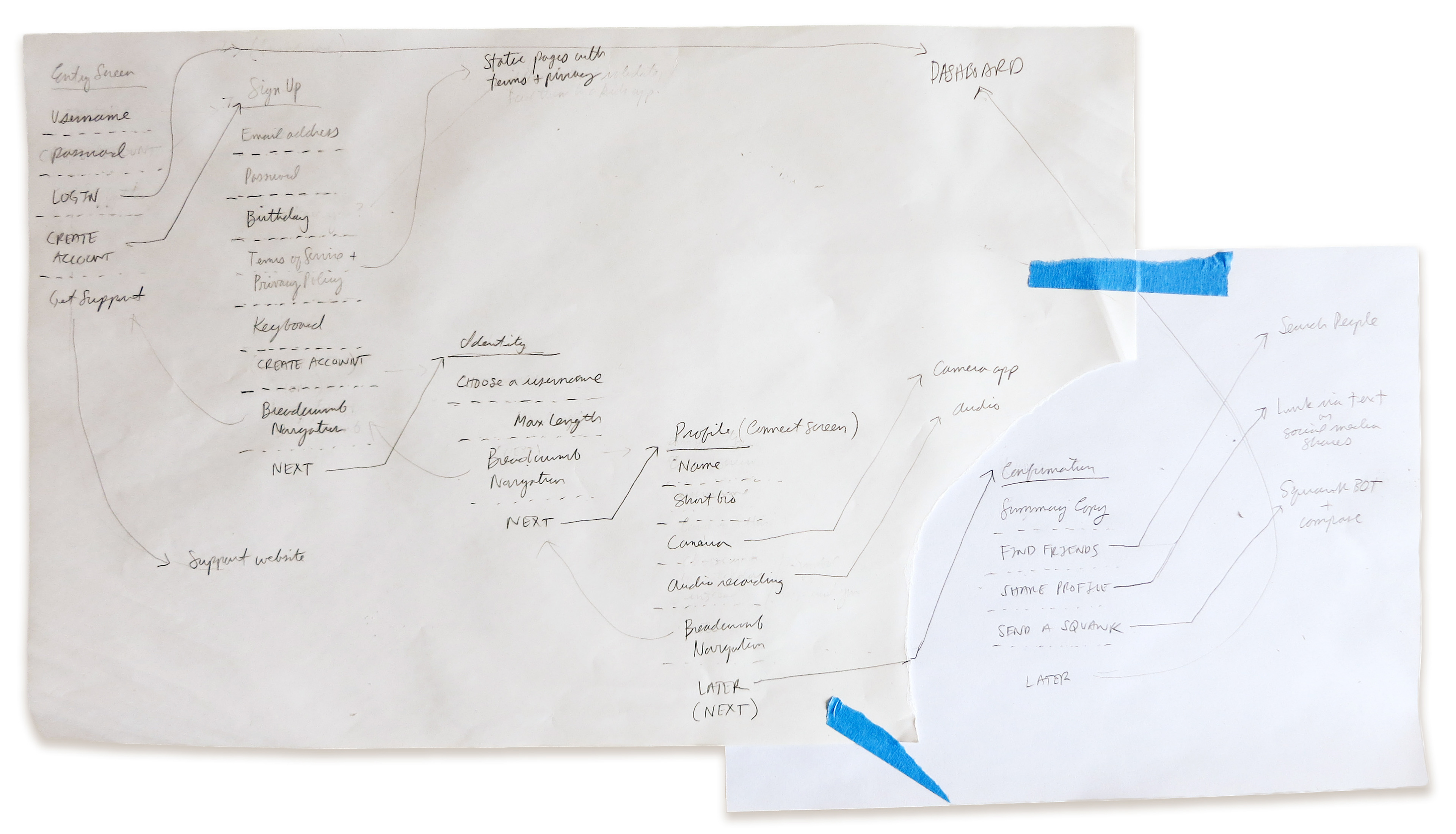
This flow details one iteration of the onboarding process in Squawkin Crowd Messenger. Each chunk of writing constitutes what the user sees on a particular screen and what action he can take to move through the flow.
Arrangement OF Elements
Once my shorthand notes have adequately captured the flow, I create a layout of the elements for each screen. For some projects, I continue sketching with pencil and paper. For others, I opt for a higher fidelity mock-up and go straight to Sketch using only black, white, and gray for element values.
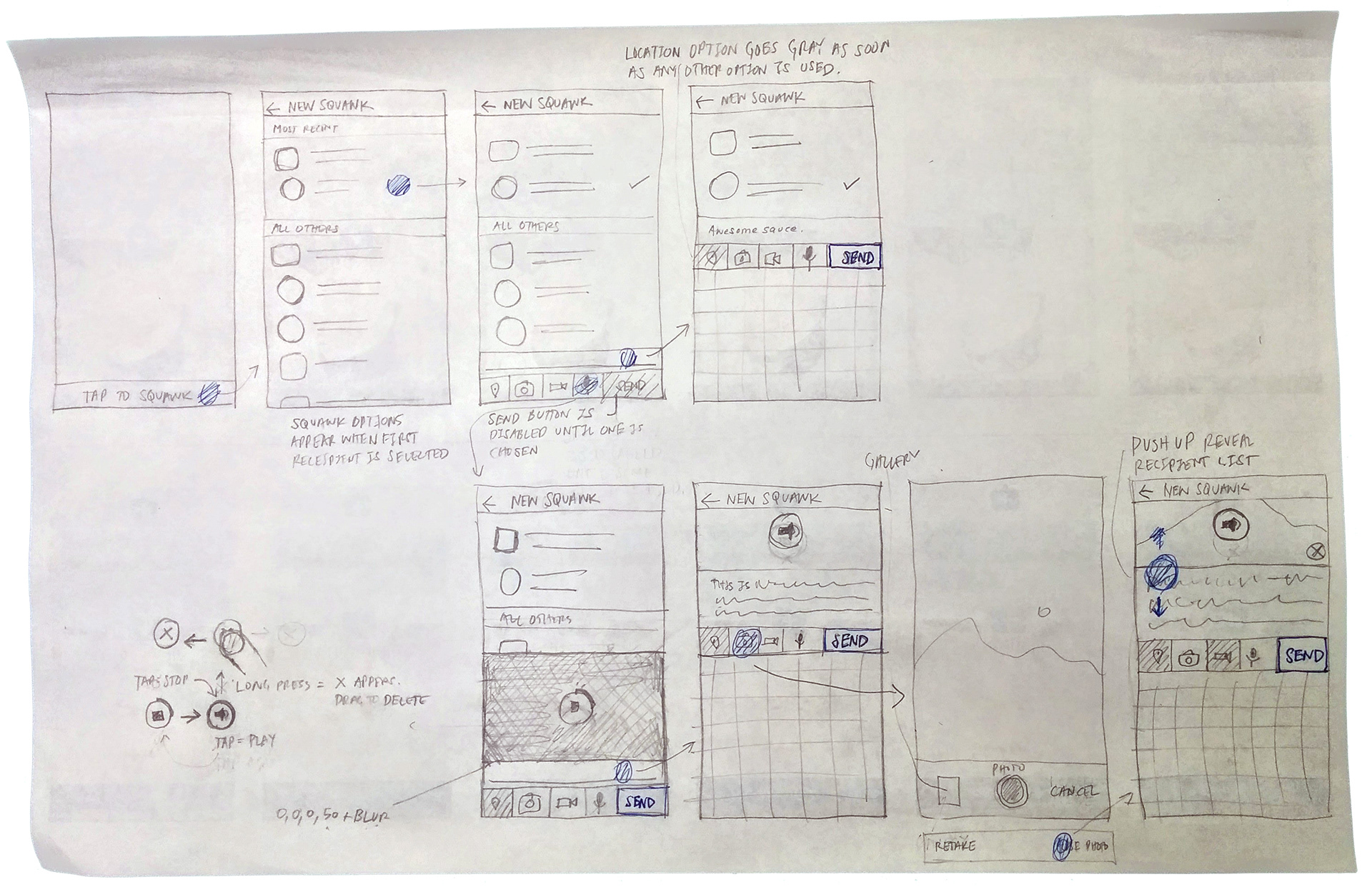
Sketches of layout and interaction for one iteration of the process of composing a squawk.
At this point, I also reference the App Master Flow and begin to think about all the points where this feature will touch the existing structure of the app and how it will integrate into it.
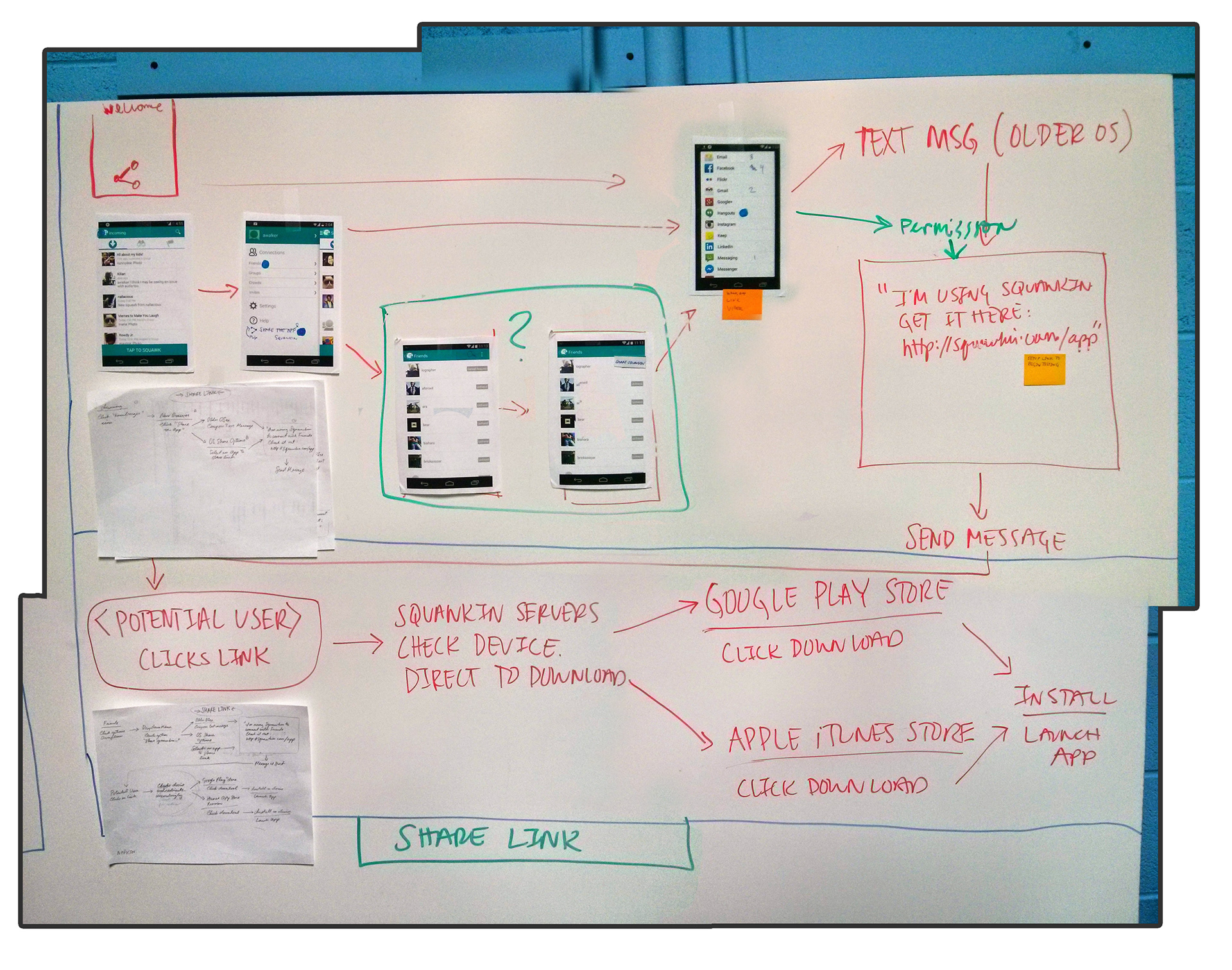
Whiteboarding how the flow for sharing the app integrates into the existing product.
Static Mock-ups
In our development process, we typically don't take the time to do elaborate wireframes. We opt instead to do black and white layouts in Sketch and then move those into either Invision or Flinto to create an interactive mock-up.
In the Spring of 2015, I changed our workflow so that we design all mock-ups, for both iOS and Android, at 1x (1pt = 1px). I then scale assets proportionally when I generate them for inclusion in the product.
In the Spring of 2015, I changed our workflow so that we design all mock-ups, for both iOS and Android, at 1x (1pt = 1px). I then scale assets proportionally when I generate them for inclusion in the product.
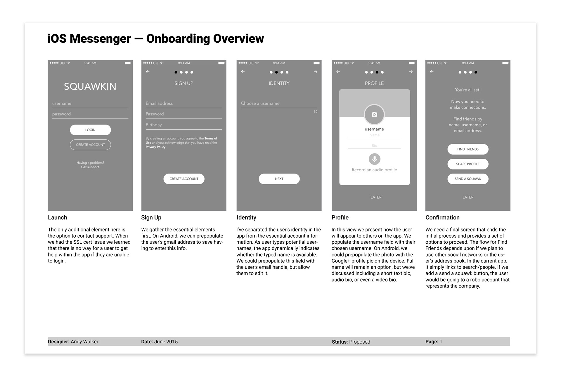
A series of static screen mock-ups outlining one iteration of the Squawkin onboarding flow. I use these presentation sheets with my comments to initiate discussion among members of the product team.
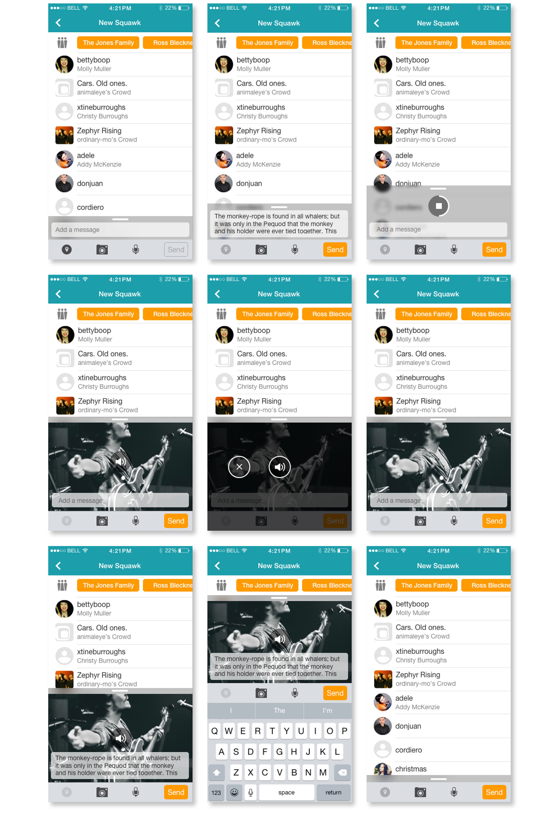
I created this series of high-fidelity mock-ups of one iteration of the compose flow to check element dimensions and proportions when combining various types of media in a single message.
Interactive Mock-ups
I’ve learned, at this point in the process, language is not the answer. Flows take place in time, so it’s incredibly useful to see and show them in motion. Seeing how to move through a sequence of views helps reveal issues that can’t be seen looking at static mock-ups. When should the keyboard drop away? What text input should be in focus on the transition? What error message do we display if the form doesn’t validate?
So motion helps me anticipate a more useful solution, but — more importantly — it helps me communicate to the developer what we are trying to do. A clickable prototype serves as a point of departure to discuss the feasibility of the design and for the developer to highlight any technical issues or red flags she immediately sees. It also serves as a vehicle to navigate the pros and cons of different approaches and to tune micro-interactions that enhance the overall craft of the product.
So motion helps me anticipate a more useful solution, but — more importantly — it helps me communicate to the developer what we are trying to do. A clickable prototype serves as a point of departure to discuss the feasibility of the design and for the developer to highlight any technical issues or red flags she immediately sees. It also serves as a vehicle to navigate the pros and cons of different approaches and to tune micro-interactions that enhance the overall craft of the product.
A preliminary interactive mock-up showing a change to the overall structure of Squawkin Crowd Messenger. The most significant change is the introduction of a Tab bar in place of a Navigation drawer. Additionally, this mock-up shows a revamped compose flow that provides the additional option of video, as well as the option to share a location as part of the combination of text, image, and audio.
I created this interactive mock-up using Flinto Lite in February 2015. In this particular case, this prototype helped raised an important question about if we could do dynamic search and what should happen when a person reached the end of the initial results after scrolling.
Inspiration
Below I've included links to thinkers, and certain essays they've written, that have informed my way of working.